Lost in Translation
Looking for meanings in words, images and sounds
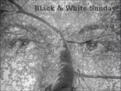
Black & White Sunday: Shape (response to Guest challenge)
To quote today’s guest challenger Debbie Smyth:
“For me the most important point about monochrome is that by removing the distraction of colour, the photographer is able to direct the viewer to the key elements of the image. Going monochrome is one of several tools we have as a photographer that allows us to provide focus.”
I’m going to show you three edits of the same photo I took recently. One is as shot which in this example looks very much like a sepia.

The second one has added colours which is diverting the viewer’s eye from the shape of the subject.

And the third one is monochrome – pure black and white photo. I hope that these three examples illustrate what Debbie had in mind for this challenge.

Follow Debbie’s lead and think about the photos you have taken in colour and try to see what they would like in black & white. Leave links to your “Shape” post and I will display them both here and on Debbie’s Guest Post.
Here come great responses to this challenge. Please click on the titles bellow:
Shapes by Suzanne
Shape by Ese
A weekend tree
Shape by Klara
Tish’s response
Shape

The B/W version looks so sharp and definitely reaches me with a higher emotional impact over the others.
LikeLike
I appreciate hearing this, Allan.
LikeLike
The silver flow of smoke in the B & W completely owns the shot. Beautiful.
LikeLike
Thanks a lot Patti. Your opinion matters to me.
LikeLike
belles images Paula j’aime beaucoup c’est très artistique
LikeLike
🙂 Grand merci, Marc
LikeLiked by 1 person
Very interesting comparison – and very interesting capture too. Personally I like the sepia but that’s just me!
LikeLike
Hello Tina, it seems that there are more than “just you” that have voted for sepia. I admire your work and your opinion matters. Thank you kindly for your input.
LikeLike
Great. Second one for me. Colours you don’t see together so often.
LikeLike
🙂 quite understandable, although there were votes in favour of each of the displayed images 🙂
LikeLike
I truly feel the shape of the match and especially the smoke is much more distinct in the sepia photo. But that’s just my eye. The color version is quite lovely as well.
LikeLike
🙂 Hello Angeline. First of all let me tell you how happy I am when I see you on my blog. I am sorry I did not upload poll for this one. I think that each edit had approximately the same number of voters. This has been a very interesting challenge 🙂
LikeLike
Yes that’s what I did Friday night: lighting a match, because of power outage! Have a black and white for Sunday, Paula. Am not sure where to link, so am leaving my url here. http://www.JeshStGermain.com
LikeLike
A beautiful scene Jesh. A solitary tree and a dramatic sky. I love it!
LikeLike
Looks really good in B&W, Paula. 🙂
LikeLike
Thank you, precious xx
LikeLiked by 1 person
Surreal caricatures.
LikeLike
I think I’m going to stick my neck out on b&w Sunday, and prefer the sepia shot. Dare I? It’s almost monochrome and I’m a sucker for gold. However, the real point is the way you capture the shapes of the evanescent, the lazy whirls and whorls and coils and interweaving of smoke. And yes, the b&w does that best. Thank you for Sunday morning pleasure in a city far from home.
LikeLike
My dear Meg 🙂 I am not saying that these shot/edits are extraordinary or anything like that but every day I have a different one as my favourite and it depends mostly on how I feel and not on my views about photography. By all means you may dare whatever you like. I will never censor you 😀 Keep warm in Warsaw, and enjoy the twins.
LikeLike
Fierce competition from the other babcia, unless I’m wearing a silver pendant!
LikeLike
😦 do they call you “babcia” too? She should let you have your moment for the time being.
LikeLike
They’re living with her between apartments. And it’s the kids who do the preferring. After all she’s stable: she doesn’t flit off to the other side of the world just as they get used to her.
LikeLike
How old are they now?
LikeLike
Two each!
LikeLike
What a terrific selection of photos – I agree with your analysis though I do like them all – the middle one is intriguing.
LikeLike
Thank you very much Suzanne. I like your shapes too 🙂
LikeLiked by 1 person
I like them all very much but my favourite has to be the top sepia one. I wonder if I would have preferred the black and white one if I had looked at it first?
LikeLike
🙂 we’ll never know. Thank you very much Annette.
LikeLike
I am really fascinated by the way you play with fire, Paula! 🙂 Fabulous photos…every single shade of them!
Must admit, though black used to be my favourite colour, I am a fan of the mix of different vivid tones AND of the second photo here. That being said, in the monochrome my focus does…calm down a bit, making it possible to notice the tiny details of the match and movement of the smoke I hadn’ t before.
LikeLike
By the way – which from all three versions is your favourite one? Just the viewer’s curiosity… 😉
LikeLike
First 2nd then the 3rd one 😀
LikeLike
You have a way with words Ese. It is always such a pleasure to read your comments. I am in a hurry to see what you have for this Sunday 🙂 Thank you!
LikeLike
Thank you for your valuable opinion Ese, and most of all for your submission. These peppers look quite different in black & white. You noticed well – I like to play with fire 😀
LikeLike
This is such an interesting challenge. Your take, Paula, really makes us LOOK. And though it seems counter-intuitive in so many ways, the B & W version is certainly the most striking (excuse pun). 🙂
LikeLike
I really love that second version Paula. It looks great with the coloured smoke!
LikeLike
🙂 Thank you CG. I will post for your CS tomorrow 🙂
LikeLike
B&W is my fave , but I love them all!
LikeLike
Ciao Anna 🙂 I was really interested to hear what everybody had to say. I can see that the votes are divided in almost equal parts between all three. Ti ringrazio 🙂
LikeLike
What a great example… Love the uniqueness of the picture…
LikeLike
Many thanks, Lumar 🙂
LikeLike
Amazing what a difference colour makes. My favourite in this series is the second. I think the hints of colour brings a little more atmosphere into the photo, I think. Makes one think of hazy smoke.
LikeLike
You are right Colline, colours enhances haziness as it diverts from the bare shape. I am really glad you stopped by to comment.
LikeLiked by 1 person
amazing photo and great edits. although each is beautiful in its own way, i guess my favorite would be the first one. simplicity of monochrome with a hint of gold.
now this was “in-coordination” big time!!! I went this morning to feed friend’s cat – took my pocket camera -“au cas où” (one never knows 🙂 ). saw 3 incredibly bizarrely burnt candles on her table. took a few sloppy photos and returned home. than i checked sunday challenges and realized candles would make a great choice for todays theme. you don’t think i didn’t return? :-). with my nikkor 50mm.
and i took your approach and presented in color with stronger contrast and graduated filter and some kind of BW.
http://lessywannagohome.blogspot.be/2015/02/bw-sunday-shape.html
LikeLike
I like your kind of BW 😀
LikeLike
Immense capture seems to have frozen the moment perfectly
LikeLike
Thank you very much Scott. Do you have a preference between the three?
LikeLiked by 1 person
The Mono – no doubt
LikeLike
Cheers! I really appreciate your input.
LikeLike
🙂 this is much appreciated Scott.
LikeLike
Here’s my B & W, Paula. http://wp.me/pKVAM-1a6
LikeLike
Fantastic, Tish. Really fantastic. I am really drawn to each of them, but if I have to choose between a B&W and sepia here, I’ll go with B&W. Thank you for yet another great response. I hope that Debbie will stop by soon.
LikeLiked by 1 person
https://willothewizp.wordpress.com/2015/02/09/black-white-sunday-shape/
Love these entries
LikeLike
Me too, and I really, really liked yours 😀
LikeLike
I loved the sepia shot !!! ❤
LikeLike
🙂 I called it “sepia” but it is actually – “as shot” image. I appreciate your input, Andy.
LikeLiked by 1 person
the music matched the images and feel of the post P – well done – and truly beautiful.
I also really like the quote from deb and the 3 images – and I am glad I came here when I had time to pause and enjoy – ❤
LikeLike
🙂 xx
LikeLiked by 1 person
😀
LikeLike
Love your comparison photos, Paula.
LikeLike
So lovely to hear that, Linda.
LikeLiked by 1 person
Interesting pics Paula! I like them all — each has a different mood and feel to it 🙂
LikeLike
Finally someone who can’t decide which one works best. You know how much I appreciate your view, buddy Thank you 🙂
LikeLike
One of the best posts on analytical examination on focus and filter/monochrome effects. Great job, Paula. You displayed this very well.
LikeLike
I love the original Paula, with a hint of colour. It is just stunning!!!
LikeLike
Pingback: Black & White Sunday : Shape (Guest challenge by Debbie Smyth) | acbistro
Hi Paula, I find them all interesting but the B&W to me is the one that I prefer. The definition of the smoke is incredible and the texture at the tip of the match stick is fantastic.
LikeLike
Cheers Mark 🙂 Hope you are doing well…
LikeLike
Muito bonitas! ❤
Adoro fotos com fósforos! 😀
LikeLike
Eu tambem 😀
LikeLiked by 1 person
😀
LikeLike
You seem to like playing with fire. Nice series of shots,
LikeLike
Happy you approve 🙂
LikeLike