Lost in Translation
Looking for meanings in words, images and sounds
Guest Challenge: Let the Shapes Shine Through (B&W Sunday)
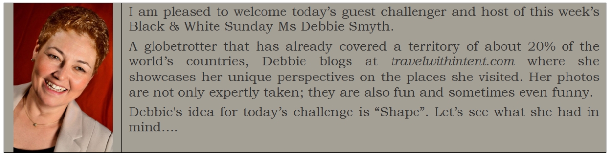
Debbie Smyth
“The art of photography is all about directing the attention of the viewer.”
-Steven Pinker
This week, I’m delighted to be writing a guest post for Paula’s Black & White Sunday Challenge.
I love black and white photography, and for many reasons. I’m a big fan of street photography; due to the brilliant works of some of the greats such as Henri Cartier-Bresson and Gary Winogrand, and the recently discovered Vivian Maier, black and white and street photography go hand in hand in my mind. Going monochrome can, in my view, add anonymity for the subjects and increase atmosphere. For me the most important point about monochrome is that by removing the distraction of colour, the photographer is able to direct the viewer to the key elements of the image. Going monochrome is one of several tools we have as a photographer that allows us to provide focus.
To illustrate, here’s a couple of monochrome edits of two structures in La Defense, a business area in Paris.


Now, here is the original – the eye can’t help but look at the colours, rather than the shapes. There’s nothing wrong with that, but I wanted people to take note of the curves and the juxtaposition of shapes, not the redness of the arch.

This doesn’t apply only to architecture; in the scene below, the thing that caught my eye was the way the shapes of the two men preoccupied with their phones echoed the shape of the metallic sculpture in the foreground. In the colour version the eye is dragged too quickly to the bright buses, whereas I wanted to highlight the shapes.


In the shot below, on the much-photographed Millennium Bridge over the Thames, I opted for a high contrast black and white image to highlight the balance of shapes: the lone person below and the bustle of people above.

I hope my musings have inspired you to post your own monochrome masterpiece.
“Black and white are the colors of photography. To me they symbolize the alternatives of hope and despair to which mankind is forever subjected.”
-Robert Frank
Notes:
Steven Pinker – b 1954, Canada, experimental psychologist and author, specialising in visual cognition and psycho-linguistics.
Robert Frank – b. 1924, USA, photographer and documentary filmmaker – his most notable works the 1958 book, The Americans.
Here are the responses to this guest challenge:
-
http://artifactsandfictions.com/2015/02/08/b-w-sunday-challenge-shapes/
-
https://esengasvoice.wordpress.com/2015/02/08/black-white-sunday-shape-guest-challenge-by-debbie-smyth/
-
http://lessywannagohome.blogspot.com/2015/02/bw-sunday-shape.html
-
http://jeshstgermain.com/2015/02/08/a-weekend-tree/
-
http://tishfarrell.com/2015/02/08/black-white-sunday/
-
https://willothewizp.wordpress.com/2015/02/09/black-white-sunday-shape/

Love this and agree. Ben Casey and Old Superman shows rock.
LikeLike
Very illuminating post, Debbie, and in all senses. That last photo, though, is really intriguing. The stance of the figure at the foot of the steps demands one’s attention.
LikeLike
Oh yes, that last shot is “so Debbie”. I am glad you were able to see this post, Tish 🙂
LikeLiked by 1 person
Good post, Paula! Right up my alley!
LikeLike
😀 It is a guest post by Debbie Smyth 🙂 She is great. I know you are very busy Allan, but would you consider hosting a photo challenge on my blog some time?
LikeLike
Sure! I’d be honoured!
Let me figure out some time to do it and hopefully not one that’s already been covered.
LikeLike
This is super news Allan. I have it covered until June. So the second half of the year would be great. One Sunday….. in black and white. I am so happy you agreed 🙂
LikeLike
P.S. On my page “Scheduled challenges” (on the menu) you can see the themes and scheduled posts.
LikeLike
What a great post and how good to meet Debbie!
LikeLike
I agree. I am extremely privileged to have Debbie as a host 🙂
LikeLike
Pingback: Let the Shapes Shine Through | Travel with Intent
Reblogged this on Travel with Intent and commented:
Here is my guest post on Lost In Translation.
LikeLike
A thoughtful and illuminating riff on the reasons for going b&w. I love the way you illustrate with examples that prove your points dramatically, and offer a great portfolio of your photography. You’ve certainly proved that colour distracts from form. I particularly like the mobile phoners image: the metallic sculpture and its reflections and the way it echoes the curve of the humans – only a brilliant and alert eye could have captured that synchronicity. I also enjoyed your quotes – surprised to see Mr Pinker there! Thank you.
And thank you Paula for your inspired idea of guest posts.
LikeLike
Pingback: B & W Sunday Challenge– shapes | Art and Life
Thanks for introducing us to Debbie, Paula. I really enjoyed this challenge for it made me look at my own photos with a new eye. I particularly like the last one of Debbie’s photos – the shape of the figure in the bottom right really adds to the composition and makes the photo much more dynamic. Here’s my contribution to the challenge http://artifactsandfictions.com/2015/02/08/b-w-sunday-challenge-shapes/
LikeLike
I have noticed on her blog how much attention Debbie pays to the details, various shapes from different angles, and her photos always have an interesting perspective. Rather often – the one I would never think of and wouldn’ t have been able to notice without her revealing it. I rarely think of how much a colour can be a distraction of perception but in this post it is illustrated in such a clear way. Needless to say – fabulous photos, especially the ones with the metallic sculpture. There is so much to see and going monochrome is the best option.
Here is what came to my mind today: https://esengasvoice.wordpress.com/2015/02/08/black-white-sunday-shape-guest-challenge-by-debbie-smyth/
LikeLike
An interesting and informative post. I learned something new.
LikeLike
As a one-time sculptor, shapes almost always trump colour for me. Thanks.
LikeLike
🙂
LikeLike
Pingback: Black & White Sunday | Tish Farrell
Great photos. I love Debbie’s blog.
LikeLike
Yes!!! I do too. Thank you very much for coming over here Raewyn
LikeLiked by 1 person
Great idea and beautiful execution; love the explanation and agree on every photo it works for b&w!
LikeLike
Oh Ron, thank you very much. I know you are often busy, but would you consider hosting a challenge here. I need someone for colour challenge in June and later on whatever month suits you best?
LikeLike
Hi Paula, not sure what colour challenge means, so if you can fill me in?
But happy to help out, prefer July then, lots of travels coming up til then 😉
LikeLike
🙂 Great. It means that it is in colour, not in B&W and that’s why I thought of you as you are the greatest “colourists” among my photographic WP buddies. It can be a single photo, or several. So far there was just one guest challenge post: Knowing your place. July is perfect then 🙂
LikeLike
well I am working my way “back” thru posts – and now I see more of the quote and challenge here – I was all set to grab some photos this weekend – and I am looking for benches too – but had a lot of weekend work to do – so no photo opps for moi yet (yet!)
I really enjoy the guest posts that you are doing too – you are creating a rich web resource while giving us community webbing at the same time
LikeLike
I’ve been trying a little bit more of converting some of my pictures to black and white. It’s often surprising what you end up with! Quite fun indeed! Love the above examples.
LikeLike
It’s particularly effective with La Defense, isn’t it? I must have a wayward eye because mine lingered on that curved post in both versions. I had to ask myself ‘what blue bus?’ 🙂 Great shots, as ever. Thanks for the shares.
LikeLike