Black & White Sunday: Cityscape

Do you prefer cityscapes in colour or in black and white? This one is a photo of Venice, a panorama to be exact, made by stitching several  frames.

B&W panorama venezia_more_potpis

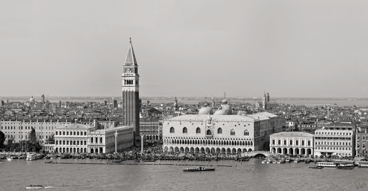
(If you click on the photo to zoom in, you’ll be able to see all the details)


mergeyes_widget


I would like you to check out participants’ entries. Click on the titles bellow:

Singapore Skyline by Debbie

Cityscape by Ese

Cityscape by Art is Horseshit

Cityscape by Susan Judd

Cityscape by Klara

Cityscape by Traces of the Soul

Cityscape by the Jagged Man

Cityscape by Middletone Road

Cityscape by Lucile

Cityscape by Francesca

Cityscape by Colline

Cityscape by Mofman 

69 responses to “Black & White Sunday: Cityscape”

  1. I like them in both! I often find it hard to choose – it does depend on the individual shot, but in the end it comes down to my mood and the effect I want at the time. I like your Venice shot in b&w – in colour it would be “oh that’s pretty” but in b&w it invites you to look more closely and enjoy the architecture. I’m off to choose my own cityscape to share with you …

    Like

    1. Oh, I did not except the nigh shot. I love it Debs 🙂

      Like

  2. I agree with Debbie…depends on my mood, and the subject matter. Actually, I don’t think I’ve much in the way of cityscapes!

    Like

    1. l like what you offered Sue 🙂

      Liked by 1 person

  3. […] Linked to Weekend in Black & White. […]

    Like

    1. Right, I don’t remember seeing many B&W’s from you.

      Like

      1. Only when nudged, or in a fiddling mood. A photo has to be really good to b&w it successfully. Your photos are really good!

        Like

  4. Wow Paula, what a great shot and I hope everyone clicks it to see it big screen for even more fabulous detail!

    Like

    1. Thank you very much, Patti. 🙂

      Like

  5. That’ s a tough question…probably colours add more…liveliness to a cityscape while B&W reveals much more detailed perspective. Like B&W films that sometimes turn out to be more impressive and…pronounced than the other ones. I think I am still balancing between those two!
    Your panorama of Venice is exquisite…perfectly stitched, just like Italy is (for me). And that feeling of almost stillness in the photo which – when looking a bit closer, turns into movement of various types.
    Here’s mine: https://esengasvoice.wordpress.com/2015/08/09/black-white-sunday-cityscape/
    Have a great Sunday, dear Paula! 🙂

    Like

    1. Thank you for this analysis and your views on colour vs B&W. You are very perceptive, and yes this photo is best viewed zoomed in. I always enjoy your entries and am very intrigued with your cityscape. Beautifully captured; love the winding coastline in the background.

      Liked by 1 person

  6. It depends:
    If you are dealing with an exceptional take , I think B&W may give it a particular touch of classic and solemn taste…
    Otherwise , the colour version may add interest and vividness to an ordinary one…
    This Venice , is simply awesome!

    Like

    1. Thank you for commenting. I think that B&W was a good choice here though I had posted the same scene in colour before.

      Like

      1. I perfectly remember , and loved that version too, but this one is something you could find in an encyclopedia or in an artist collection…
        H&K

        Like

        1. Grazie, Anna 🙂

          Like

  7. hmmm, tough to say. I guess for me it depends on the individual photo.
    http://lessywannagohome.blogspot.be/2015/08/bw-sunday-cityscape.html

    Like

    1. Your view of Tokyo is impressive and the shot is so clear. Thank you, Klara.

      Like

  8. […] See more cityscapes at Paula’s blog here. […]

    Like

    1. It’s a great city. Thank you, Sue.

      Liked by 1 person

  9. I absolutely love cityscapes in black and white. Great shots.

    Like

    1. ‘m glad you do. Thank you kindly Desley.

      Liked by 1 person

  10. Both are enjoyable to look at, I think. It always depends on what the photographer wants to focus on.
    PS: I will go out today to take a specific photo – I will share it with you later (probably tomorrow 🙂 )

    Like

    1. Thank you, Colline. I look forward to seeing the result of your shooting.

      Liked by 1 person

  11. Your B&W is good, but in general I prefer cityscapes in colours. To be more specific: night cityscapes in colours.

    Like

    1. I like them all 🙂

      Like

    1. They are lovely, thank you.

      Like

  12. […] Black & White Sunday – Cityscape […]

    Like

  13. Beautifully done, Paula. This came out very well.

    Top contributions from everyone else too. I’ll be posting mine shortly.

    Like

    1. Thank you very much, Allan. I look forward to your post.

      Like

  14. I’m biased for my love to black and white photo, which makes me focus on the structure and contrast and not get lost enjoying the overall colorful view. It’s a matter of taste but as a generalist, I can say that B&W help me to focus.
    Your photo is simply gorgeous. Well executed. It’s not easy to stitch frames. Well done.

    Like

  15. […] In response to Paula’s Black & White Sunday challenge theme of cityscape […]

    Like

  16. Hi Paula ,there is an exceptional beauty in classic black and white pictures .Jalal

    Like

    1. Thanks, Jalal. Lovely to hear from you. 🙂

      Like

      1. Lovely to hear from you Paula.

        Like

  17. Hi Paula- There is something timeless about your panoramic photo of Vienna that makes it really striking. It would work well in sepia, too, I think, but as it is, I can envision it lining the cover of a book, wrapping all the way around from front to back cover, or even inside the front cover, continuing inside the back. Very nicely done! Best, Babsje

    Like

    1. Thank you very much for the praise Babsje. I was thinking about sepia too, and this one has a tiny touch of it 😉

      Like

      1. You’re welcome, Paula. It really is timeless, and I can also imagine viewing it through one of those old-time hand-held stereoscopes. Best, Babsje

        Like

  18. Fabulous image, Paula. It really came to life when I clicked on it. 🙂

    Like

    1. Many thanks my dear Sylvia. I am so glad you gave ti a click. Hope the tune was to your liking too. xx

      Like

  19. […] Paula’s Black & White Sunday I am using to very different views and types of a cityscape. The top one is of Louisville, Ky taken […]

    Like

  20. Very nice panorama Paula! I have not had the time to devote to finding what I am doing wrong on the few I have tried but who knows maybe I can try again at a later date. As far as cityscape in B&W verse Color: I like day time shots in B&W and night captures in color. So here is a day time and a night shot in B&W : http://daffodilhillphotography.com/2015/08/09/black-white-sunday-cityscape/

    Like

    1. Daytime shots in B&W and night captures in colour 🙂 I think my hubby said the same thing. Great hearing your opinion, John and thank you for sharing such lovely photos.

      Like

      1. You are very welcome Paula, and as always my pleasure.

        Like

  21. I like them both, but I do like to add a little touch of color. Lovely shot.

    Like

    1. I understand Lor 🙂

      Like

  22. For me, Venice isn’t Venice without the colour. (well, you did ask! 🙂 ) But I adore the black and white tiles beneath your feet 🙂

    Like

    1. I know your views, but they are not B&W

      Like

  23. Paula, it seems that the link to today’s (12/08/2015) Thursday Special is malfunctioning. There is no post.

    Like

    1. It will be up.at midnight. I pressed published by mistake. Thank you for telling me, Klara.

      Like

      1. hehehe, I just realized it’s not Thursday 🙂

        Like

  24. It’s actually refreshing to see a Venice photograph in B&W 🙂 Nice one, Paula.

    Like

    1. Thank you, Uday. I thought that a timeless city like Venice deserved a B&W rendition 🙂

      Like

  25. Cityscapes and architecture really photograph well in B&W. Great shot, Paula.

    Like

    1. Venice is eternal or so we would like to believe, and I thought it would be fitting to make it B&W. I appreciate your kind comment, Draco.

      Like

  26. […] (This post was written as a response to Paula’s Black & White Sunday prompt: cityscape) […]

    Like

  27. I like both – but is not used to B&W myself. Practicing to get better…These are great!

    Like

    1. I firmly believe that your black and white photography would be as good as your photography in colour.

      Like

      1. Thank you for this encouragement, Paula! I might try a little harder!

        Like

  28. I adore city-scapes in black-and-white and also in very muted colour the most, especially brushed with fog or brooding with rain or the threat of rain or storm. I see more details and tend to notice more depth, shape, and contrast. I also tend to feel more emotion in a black-and-white city-scape. I do adore the rich bright colours of the lights punching through a deeply blue twilight, very much too, or the vibrant saturation of copper sunlight beaming off glossy buildings at sunset, or the blaze of fiery trees touched with the glow of autumn nestled amongst the scintillating skyscrapers…and…Bah, I love it all! And I loved every photo in this entry. Brilliant. And the music was absolutely delightful- I had to play it twice! All the best,

    Autumn Jade

    Like

    1. Autumn Jade, I really appreciate that you came here to admire the entries. The way you talk about photography shows how passionate about it you are. (I love that piece of music too 🙂 Thank you, Paula

      Liked by 1 person

  29. […] the bold white text, and head on over to Lost in Translation. Take on Paula’s […]

    Like

This box is reserved for sharing positive vibes.

This site uses Akismet to reduce spam. Learn how your comment data is processed.